NODAL
Connecting communities that practice together.
The social media landscape is changing fast, but many of the top platforms seem to focus on driving more and more eyeballs. Research indicates that most people are concerned with the direction these platforms are going in — user experience has drastically changed, as they prioritize consumption over creation/dialogue.
Nodal is based on a simple idea: a thoughtful social platform that brings physical practitioners and their communities together.
ROLES
As part of my UI/UX Design Course, I assumed the following roles designing this app:
User Experience (UX) Designer
User Interface (UI) Designer
Visual Designer
DELIVERABLES
Interaction Design:
High-fidelity interactive prototypes for key tasks on iOS
UX/UI Design:
Competitive analysis
User surveys and one-on-one interviews
Personas
Task flows
Site map
Low-fidelity wireframes
High-fidelity mockups and prototypes
Usability tests and findings
PROJECT SPECS
Duration: 3 Weeks (100 Hours)
Tools:
Figma
Optimal Workshop (Research)
PROBLEM
The general direction that popular social media platforms are heading in doesn’t allow for any nuance or discourse. It’s mostly driven to gain as much attention as possible and keep people scrolling. Because of this, the user experience for those who’d like to share insights into their physical training and create a dialogue is hindered by the distractions built into these platforms.
PROPOSED SOLUTION
Modern social media meets old-school forums.
The solution would be to create an ad-free social media platform with a mix of “feeds” and commenting capabilities, while simultaneously creating a more intimate semi-private space where groups can share and discuss on a smaller scale.
PROCESS OVERVIEW
01
RESEARCH
GOALS
I wanted to learn why and how people share their physical training on social media platforms.
I also wanted to learn why people use certain social media platforms over others, in order to understand how to create a better user experience for them.
Screener: People who use (or have used) social media to create, share, or consume anything training-related. (e.g. fitness, lifting, dancing, climbing, or any other type of physical endeavor or discipline)
METHODOLOGIES
One-on-one interviews for qualitative understanding of “Why” people use certain social media platforms over others.
User surveys for quantitative analysis on the “What” and “How’s” of social media habits.
Market research helped in understanding what the current social media landscape looks like, analyzing common UI patterns, and understanding the different features amongst top platforms and other niche platforms.
Research Insights
Top platform used: Instagram
Research uncovered that people have an overall sense that the platforms they are using don’t have their best interest in mind. (i.e. algorithms, unrelated ads, etc)
The top reasons people share their physical training are (1) to have a place to publicly document their progress, (2) to grow their businesses, (3) and to connect with like-minded people.
USER PERSONAS:
Through my research, I found that there was a split between coaches, teachers, and therapists who wanted to share their knowledge and grow their businesses and those who wanted to share their progress with like-minded practitioners. Since the purpose of the project was to create a minimum viable product, I knew any potential business features would be something that would have to come further down the line in order to help support those coaches, teachers, and therapists.


SITEMAP
02
INFORMATION ARCHITECTURE
The sitemap went through many different variations. It was a great exercise in understanding where key features would be placed. In this case, the two main features were “Projects” and “Spaces” and I wanted them to be easy to find in the interface. In my first versions, I had “Projects” as a sub-feed under the Home screen, which caused confusion during testing - testers could not understand where to find their projects. It was clear that the importance of the “Projects” feature didn’t match where it was originally placed. The sitemap slowly came together as I tested lo-fi wireframes.
03
INTERACTION DESIGN
TASK FLOW
Here I show the task flow for
Creating a new post from the photo gallery.
Creating a new “Space.”
Read a “Space” discussion.
WIREFRAMES
Sketches
Drawing out different screens that highlight key features while also keeping to familiar UI patterns of other social media platforms for ease of use.
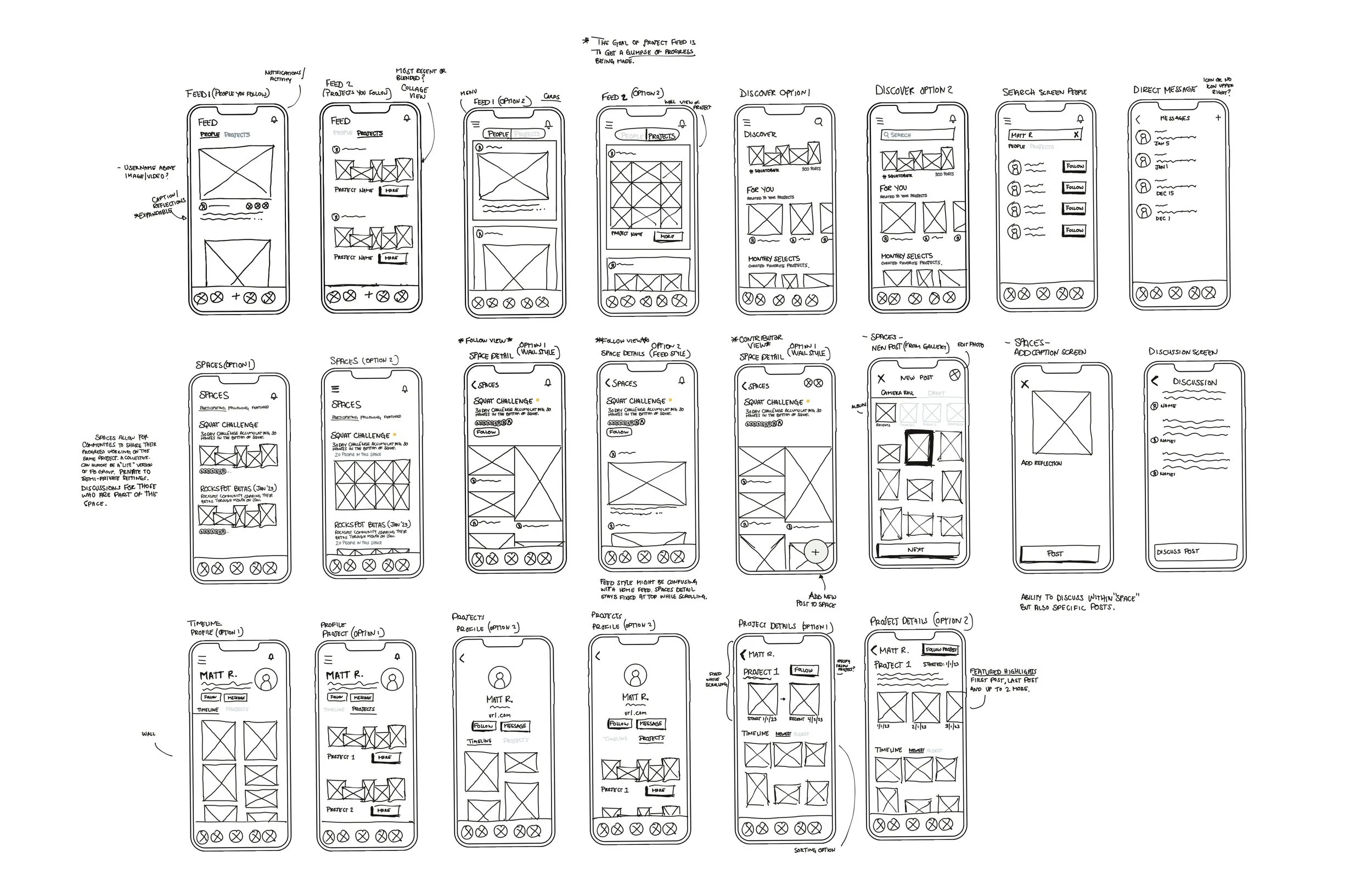
Low Fidelity Wireframes
After settling on the layout and patterns it was time to create some lo-fi wireframes to test the overall skeleton of the app. My initial vision was to take the necessary features from the Instagram app and the VSCO app.
04
UI DESIGN
If given a longer timeframe for this project, I would have continued iterating and testing the UI and given more thought to the right colors that would encapsulate the ethos of the brand - to bring communities together. Overall the design was heavily influenced by the VSCO app. Simple, minimal, and focused on the videos and pictures.
BRANDING
nod·al /ˈnōd(ə)l/ denoting a point in a network or diagram at which lines or pathways intersect or branch.
STYLE TILE
USABILITY TESTING
Usability testing opened my eyes to some holes in my design. Specifically for the “Projects” and the “Spaces.” In total 5 people tested the lo-fi wireframes and the hi-fi prototype. Given the time constraint, I was not able to make revisions for each recommendation. Here are some patterns, insights, and recommendations given by participants.
05 ITERATIONS
PATTERNS
4/5 users tapped the “+” while on the Feed screen to start a new project.
3/5 users were confused about the differences between direct messages and discussions.
3/5 users tapped the Search icon at the top to get to the Discover page when they were prompted on a screen other than the “Feed” screen.
INSIGHTS
Understanding that a “Space” can be semi-private isn’t intuitive to most.
Users really seemed to like being able to create projects separate from regular posts.
Conversations came up around whether the posts within a Space can also be a sub-feed under the home tab.
RECOMMENDATIONS
Ability to easily see post likes and amount of followers. (Low priority)
Create a Projects tab. (High priority)
Make discussions easier to get to (High priority)
Have “Discussions” fall under the “Messages” screen. (Low priority)
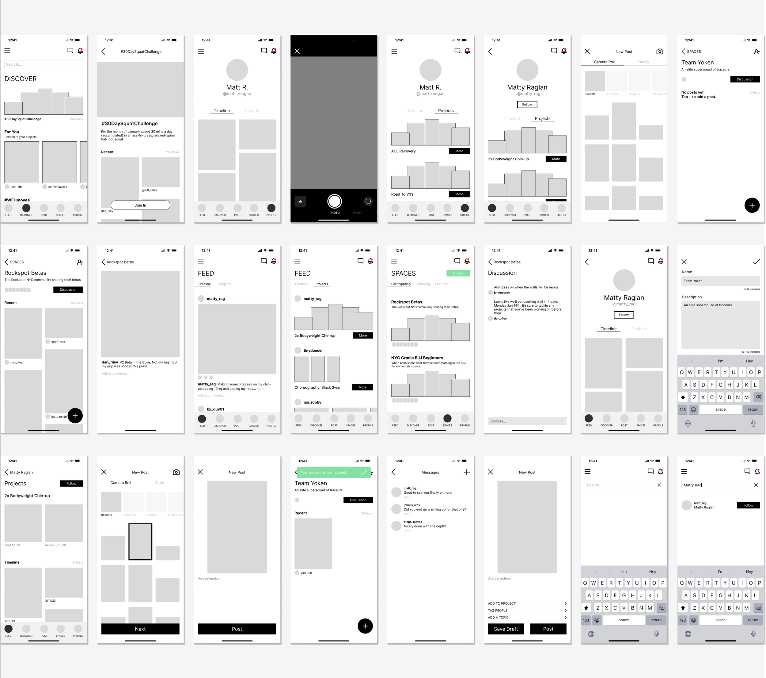
HIGH FIDELITY WIREFRAMES

I streamlined many of the pages and features from Instagram down to the most necessary ones. My emphasis was on a minimalistic and user-friendly design, allowing pictures and videos to guide the app’s visual direction. The UI patterns are heavily influenced by the VSCO app.
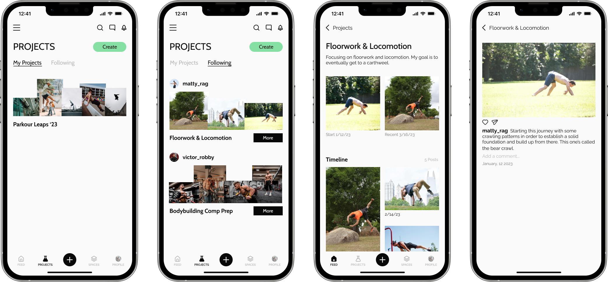
After testing, I created a separate tab within the navigation that allowed for more awareness of the “Projects'' feature. “Projects” allow users the ability to highlight something they're working on and show their progress along the way. Documenting progress was something that came up as an important reason people share their journey publicly.

Spaces allow for groups of people to come together and privately or semi-privately share the things they’ve been working on together. (Think: Facebook Groups Lite)
The example above is a local BJJ Studio holding a “space” for students in the Fundamentals course to share and discuss privately amongst themselves. I would spend more time thinking through this feature so that it feels both intimate and private while remaining cohesive with the rest of the app.
HIGH FIDELITY PROTOTYPE
Click here to open on a separate tab.
Note: Because this is a prototype, not every button or icon is active on every page.
NEXT STEPS
Enhancing “Spaces” UX
I want to continue exploring and testing the user experience of “Spaces.” Testing proved this feature to be a viable one. I think it would be interesting figuring out a way to balance the intimate experience of “Spaces,” with the public experience of sharing, following, and discovering new users.
Testing photo/video display within a space - gallery block, scrollable feed, etc.
Further testing and iteration would be needed for “Discussions.” During testing and conversations, someone brought up that “Spaces” and “Discussions” felt like a lite version of what many use Facebook Groups for.
Iterating Brand & UI
If given more time I would spend more time thinking through branding and UI that would align well with the targeted audience.
I would also build out the video player UI a bit more and what that experience would feel like. The assumption is that the app will be video-heavy, so ironing this piece out is crucial.
Notifications & “Follow” Experience
Testing also brought up questions about distinguishing the different types of notifications.
How do we distinguish buttons that specify if you’re following a user or just a project, or both?
Will notifications for “Spaces” and “Discussions” be separate from other notifications?
• fin •